Points de contrôle
Create Looks
/ 30
Merge Results
/ 40
Save Looks to Dashboard
/ 30
Analyze and Visualize Looker Data: Challenge Lab
GSP346

Overview
In a challenge lab you’re given a scenario and a set of tasks. Instead of following step-by-step instructions, you will use the skills learned from the labs in the course to figure out how to complete the tasks on your own! An automated scoring system (shown on this page) will provide feedback on whether you have completed your tasks correctly.
When you take a challenge lab, you will not be taught new Google Cloud concepts. You are expected to extend your learned skills, like changing default values and reading and researching error messages to fix your own mistakes.
To score 100% you must successfully complete all tasks within the time period!
This lab is recommended for students who have enrolled in the Analyze and Visualize Looker Data skill badge. Are you ready for the challenge?
Setup
Before you click the Start Lab button
Read these instructions. Labs are timed and you cannot pause them. The timer, which starts when you click Start Lab, shows how long Google Cloud resources will be made available to you.
This hands-on lab lets you do the lab activities yourself in a real cloud environment, not in a simulation or demo environment. It does so by giving you new, temporary credentials that you use to sign in and access Google Cloud for the duration of the lab.
To complete this lab, you need:
- Access to a standard internet browser (Chrome browser recommended).
- Time to complete the lab---remember, once you start, you cannot pause a lab.
How to start your lab and sign in to Looker
-
When ready, click
.
A new panel will appear with the temporary credentials that you must use for this lab.
If you need to pay for the lab, a pop-up will open for you to select your payment method.
-
Note your lab credentials in the left pane. You will use them to sign in to the Looker instance for this lab.
Note: If you use other credentials, you will get errors or incur charges. -
Click Open Looker.
-
Enter the provided Username and Password in the Email and Password fields.
Important: You must use the credentials from the Connection Details panel on this page. Do not use your Google Cloud Skills Boost credentials. If you have your own Looker account, do not use it for this lab. -
Click Log In.
After a successful login, you will see the Looker instance for this lab.
Challenge scenario
You are a data analyst intern for a private plane and helicopter rental company. For your first assignment, your new manager has tasked you with creating multiple dashboards to present at a company meeting. Specifically, you are required to use the provided FAA datasets to determine the best locations to set up new rental hubs.
Your manager wants the answer to the following questions:
- Which states and cities have the most airports with heliports?
- What is the facility type breakdown for the states with the most airports?
- What are the airports and states with the highest percentage of flight cancellations with over 10,000 flights?
- Where are the busiest, joint-use major airports that have control towers and what are their associated codes?
- What are the origin and destination airports with the smallest average distance between them?
Task 1. Create Looks
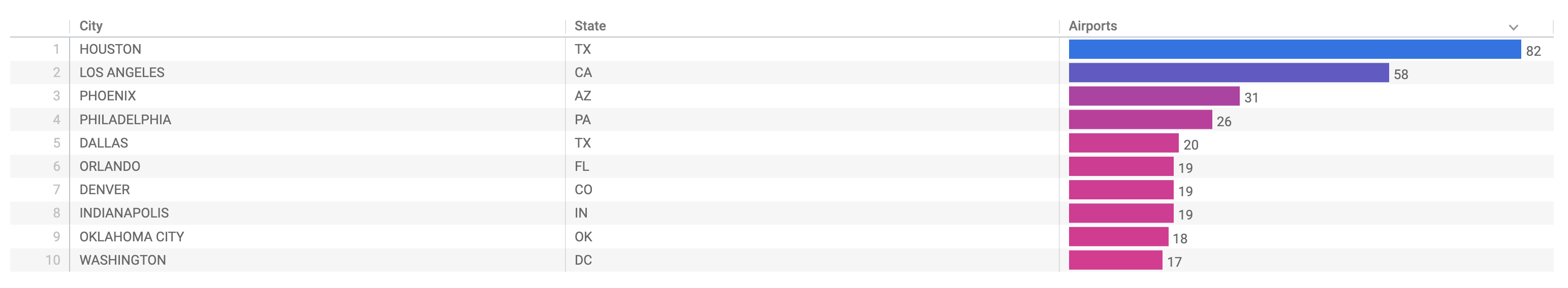
Look #1: Most heliports by state
In this section, you will need to use the Airports dataset to build a visualization that answers the following question: Which states and cities have the most airports with heliports?
- Your visualization must have the following requirements:
- A table with three columns: City, State, and Airports Count
- Limit the results (rows) to the top
states - The Airports Count column should be in descending order (most to least)
- The Facility Type should not be included in the visualization
- Save this visualization as a Look. Title it:
. Your Look should resemble the following:
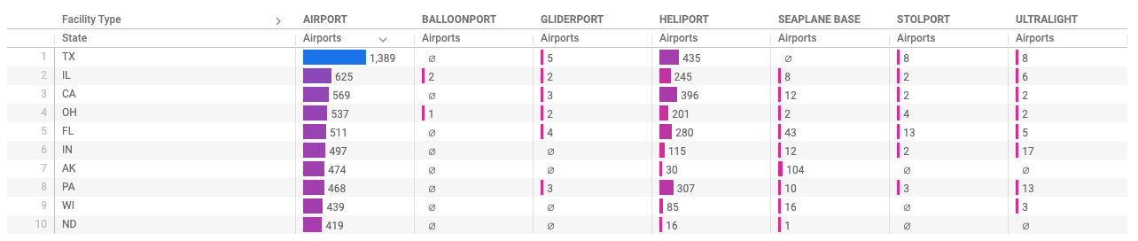
Look #2: Facility type breakdown
In this section, you will need to use the Airports dataset to build a visualization that answers the following question: What is the facility type breakdown for the states with the most airports?
- Your visualization must have the following requirements:
- A table visualization with the Airports Count, State, and the corresponding Facility Types
- Limit the results (rows) to the top
states - The Airports facility type column should be in descending order (most to least)
- Save this visualization as a Look. Title it:
. Your Look should resemble the following:
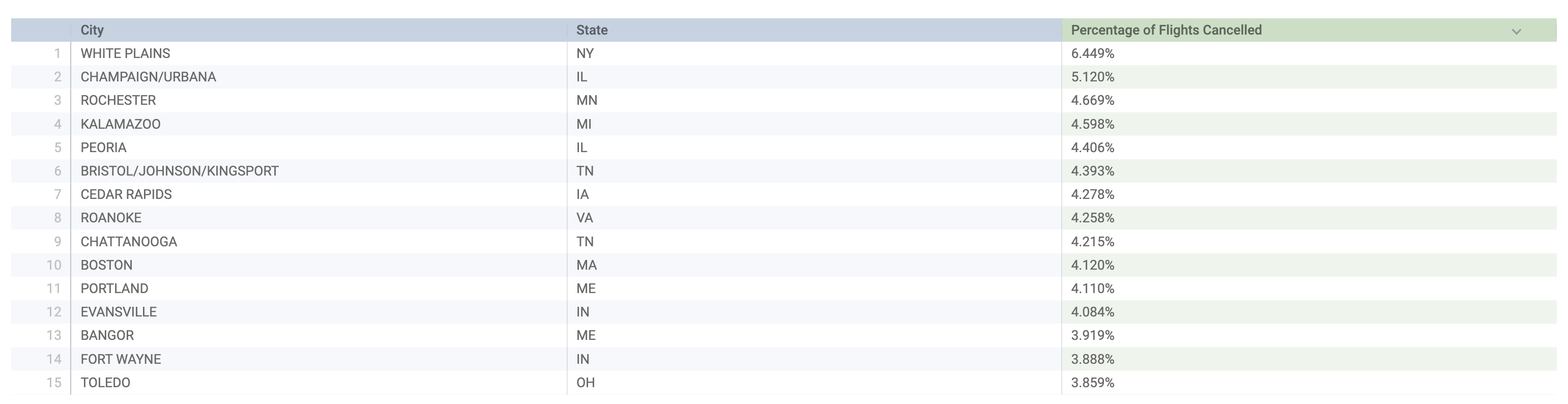
Look #3: Percentage cancelled
In this section, you will need to use the Flights dataset to build a visualization that answers the following question: What are the airports and states with the highest percentage of flight cancellations with over 10,000 flights?
- Your visualization must have the following requirements:
- A table with three columns: Aircraft Origin City, Aircraft Origin State, and Percentage of Flights Cancelled
- The Percentage of Flights Cancelled column must be created by a table calculation
- A Flights Count filter set for > 10,000 Flights
- The Cancelled Count and Flights Count should not be included in the visualization
- The Percentage of Flights Cancelled column should be in descending order (most to least)
- For the table calculation, you can use the following formula. Be sure to name the calculation
Percentage of Flights Cancelledand for formatting, usePercent (3)so your work can be accurately graded.
- Save this visualization as a Look. Title it:
States and Cities with Highest Percentage of Cancellations: Flights over 10,000. Your Look should resemble the following:
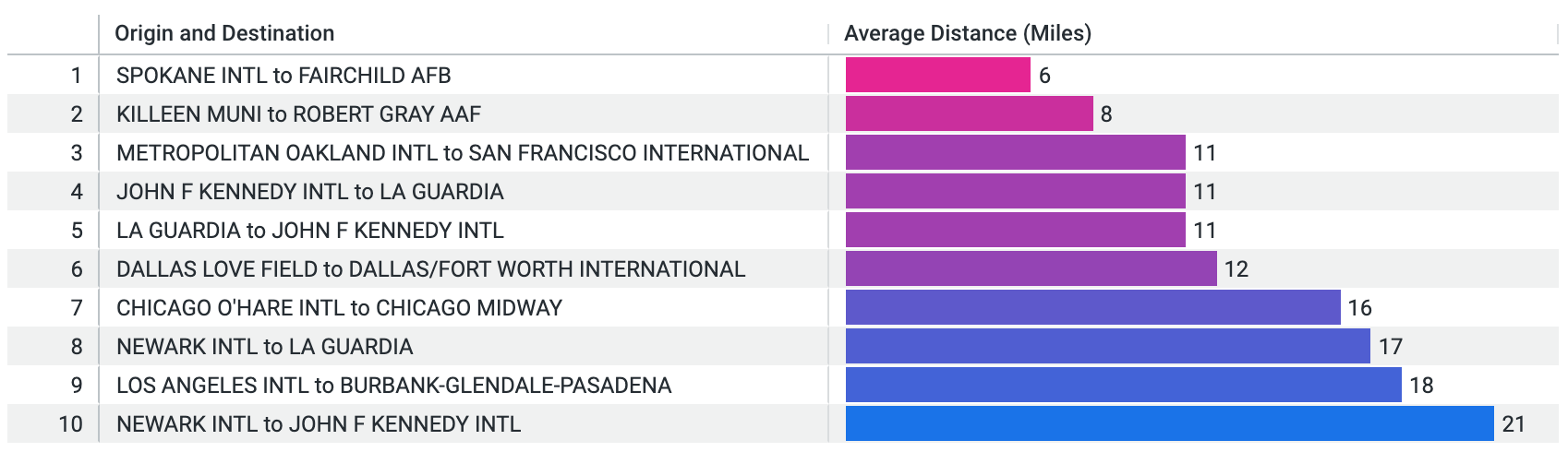
Look #4: Smallest average distance
In this section, you will need to use the Flights dataset to build a visualization that answers the following question: What are the origin and destination airports with the smallest average distance between them?
- Your visualization must have the following requirements:
- A table with two columns: Origin and Destination, and Average Distance (Miles)
- Select Average Distance field from a custom measure that calculates the average distance of flights.
- The custom measure should be named:
Average Distance (Miles) - An Average Distance (Miles) filter set for greater than 0.
- The Average Distance (Miles) column should be in ascending order (least to most)
- Limit the results (rows) to
- Save this visualization as a Look. Title it:
. Your Look should resemble the following:
Click Check my progress to verify the objective.
Task 2. Merge results
In this section, you will need to use both the Flights and Airports datasets to build a visualization that answers the following question: Where are the busiest, joint-use major airports that have control towers and what are their associated codes?
For this task, you will need to merge the two different datasets.
- Your visualization must have the following requirements:
- A bar chart that includes the City, State, and Code, with the corresponding number of flights
- Your Primary query must be from the Flights dataset, and include the Aircraft Origin City, Aircraft Origin State, Aircraft Origin Code, and Flights Count
- The following Airports source query you will merge into must be from the Airports dataset, and include the State, City, and Code. Additionally in the Airports source query, you must use three filters on Control Tower, Is Major, and Joint Use. All of these should be true (yes)
- Limit the results (rows) to the top 10 cities
-
Save this visualization to a Dashboard. Title your visualization:
Busiest, Major Joint-Use Airports with Control Towers. -
Place this in a new Dashboard named
. Your visualization should resemble the following:
Click Check my progress to verify the objective.
Task 3: Save looks to a dashboard
In this section, you will need to add all of your created Looks to a Dashboard.
-
For each of the Looks you created, add them to the
Dashboard. -
Verify the Dashboard has the four Looks you created, as well as the merged result visualization.
Click Check my progress to verify the objective.
Congratulations!

Earn your next skill badge
This self-paced lab is part of the Analyze and Visualize Looker Data skill badge. Completing this skill badge earns you the badge above, to recognize your achievement. Share your badge on your resume and social platforms, and announce your accomplishment using #GoogleCloudBadge.
This skill badge is part of Google Cloud’s Data Analyst learning path.
Google Cloud training and certification
...helps you make the most of Google Cloud technologies. Our classes include technical skills and best practices to help you get up to speed quickly and continue your learning journey. We offer fundamental to advanced level training, with on-demand, live, and virtual options to suit your busy schedule. Certifications help you validate and prove your skill and expertise in Google Cloud technologies.
Manual Last Updated March 25, 2024
Lab Last Tested February 23, 2024
Copyright 2024 Google LLC All rights reserved. Google and the Google logo are trademarks of Google LLC. All other company and product names may be trademarks of the respective companies with which they are associated.